Brand visuals

Below you can find the downloadable elements and instructions, as well as other materials concerning the Tampere.Finland brand style. We can make Tampere better known by sending a joint message under a unified brand. Together, we can make Tampere bigger than its size.
The Tampere.Finland brand materials are meant for marketing the Tampere region. Laws and good customs must be observed when using the materials, and they may not be used for ideological, political or religious purposes.
Tampere.Finland logotype
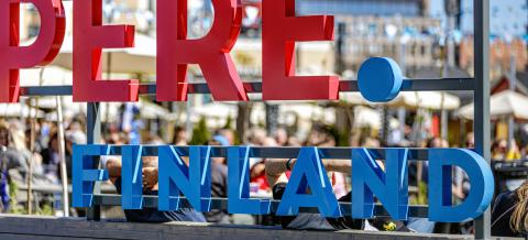
The Tampere.Finland logotype is for all Tampere-based businesses and other operators. The logotype means that the user is proud to be based in Tampere. The logotype is simple and easily recognisable. In the coloured version, the name of the city is written in brick red, a typical colour in the city. The word Finland written in blue highlights the fact that Tampere is a Finnish city, and reminds us of how the city of lakes and the Tammerkoski rapids is characterised by water. The full stop in the middle signifies Tampere’s central location in Finland. It’s also a symbol of Tampere’s goal-oriented attitude.
-
Tampere.Finland logotype

Tampere.Finland logotype

Coat of arms logo
The coat of arms logo of the City of Tampere serves as the city's signature and the official symbol of the city organization. It must be displayed in all materials related to the city's activities that communicate with the city's residents, businesses, and local stakeholders. It is recommended to use the Tampere.Finland logo in conjunction with the coat of arms logo in communication. The coat of arms logo is also used when the city has granted permission to use the logo as a partner or reference alongside another entity.
-
Coat of arms logo

Coat of arms logo

Colours
The brand colours have been given names to make them easier to remember. All of the colours in the palette may be used in connection with any theme. Tampere’s colour palette has six fresh main colours (feeling, experience, home, work, idea and change). One or two main colours are selected from the broad palette, and additional colours (no more than four) can be combined with them in a controlled manner. The base colours (two at most) balance and calm the whole. The additional colours may be used by themselves as a main/background colour.
-
Tampere.Finland brand colours
Graphic element and icons
The graphic element can be used in all materials of the city of Tampere and in all colors according to the graphic instructions. The element does not replace the Tampere.Finland logotype or the coat of arms logo, but brings more liveliness, for example, over a picture. The monochrome line drawing icons can be placed either on a colored or white background or inside a colored circle.
-
Graphic element

Graphic element

-
Icons

Icons

Tampere Photo Bank
An image bank maintained by Visit Tampere has been created for operators in the Tampere region. The Tampere Photo Bank has a wide selection of photographs of events, nature, the city centre, as well as businesses and educational institutions in the Tampere region.


